Writing your own Web Page, Block-level Layout Tutorial
A Free Crash Course in Web Design using Web Standards
Welcome back to my Free Web design tutorial using Web standards
So far in lesson one we started from scratch building the basics of a Web page. Then in lesson two we completed the html part of the whole document. I then introduced you to the power of Style Sheets in lesson three. We now need to look at page layout once again but focus on the block-level layout code.
Lesson 4
I don't know if you've realised how to use your mind's eye to look at a page's layout structure yet. But I want to make it clear to you that each opening and closing tag (where elements have both opening & closing tags) is in-fact a container. These containers can and often do contain other containers. I've mapped a typical structural layout of a page below:
That is typically the layout of the design we've built so far in this tutorial. That's pretty easy to understand isn't it?
There are other types of block-level elements that can be used within the body of a document.
Notice I've added a Menu to the left of paragraph 2 and a picture to the right of paragraph 3. These are actually very good places to add these features. You really don't want your menu up alongside paragraph 1 because paragraph 1 is much more important than your menu. The first paragraph is where you introduce your page and try to grab your visitor's attention with your keywords. It's also going to be read by search engine's visiting Web-bots and Spiders. You don't want the search engines indexing your menu and leaving out your keywords. The first 25 words on your page are very very important and we'll come back to this issue later when we talk about search engine optimisation (SEO). The picture is nicely placed down there also. Pictures can enhance a page considerably. Placed in the middle of some blocks of text down there it would do a lot to make your text more interesting and not so monotonous.The way that the text flows around the menu and picture is actually very pleasing to the eye and will make your page look much more professional and easy to read.
Pictures can be a wonderful addition to a page. But they can also be the worst thing to add to your page if you don't know what you're doing. There's been many a time that someone will say to me "Hey Phil! Come and check out my page it's got great graphics" As soon as I see the wonderful graphical masterpiece I'd say "Yeah great! But shall I test it on a 56kb dial-up download?" I'd then empty the cache memory in the computer to make it behave like I'm a first time visitor to the site. Then after waiting 15 to 30 minutes for the pictures to download I'd turn to him and say "If I were a normal visitor I would have already clicked on the back button within the first 15 seconds and not waited for this". To try and be polite, I'd then say "Shall I switch off images in my browser to help it load faster?" Typically that would then load a completely blank page because everything including the text were written as one huge image. Thankfully we don't see many pages made from one huge graphic these days, but there are still many sites out there which over use graphics.
Your page has got to download to at least a stage where your visitor has something to read within the first 15 seconds or your visitor will go somewhere else. These days even 15 seconds is a long time.
Pictures in your site should generally be no larger than 200 × 300 pixels. Smaller is preferable. You should really question yourself if you're putting more than 3 large pictures on a single page. You need some quality photo editing software installed on your computer to make decent graphics. If your picture is a photograph then it should be saved as a jpg or jpeg image. If your picture is a line drawing or coloured cartoon type picture it should be saved as a gif image, or a png image. You will need to reduce the file size of the graphic using compression or fewer bits per pixel. The trick is to reduce it just far enough before you really start to degrade the visual quality. Web images should be saved with an image resolution of 72 pixels per square inch.
TIP - Increasing the contrast of the image before saving will make it look just that bit brighter when displayed inside a Web page.
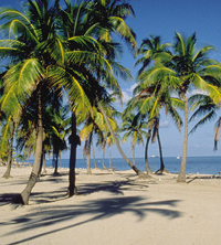
If you don't already have your own pictures ready to plug into your page I've given you a nice one of some palm trees here to experiment with.
Make a new folder called images alongside the styles folder we made earlier within your html folder. Then right click on the palm tree image and choose Save Image As from the drop-down menu. Save it into your new images folder. Here's the code for inserting that picture into your page:
Notice the alt="" this is alternate text for when your image does not show. The alt="" is compulsory for all images and you should make use of it wherever your image can be described. Example: alt="Palm trees picture".
The picture could be inserted almost anywhere within the BODY tags of your page, that could be outside of a paragraph or inside a paragraph within the start, middle or end of your text. Experiment sticking the image in in a few different places and see what you get.
This is the area that I have allocated for my image when I get it.
I've simply used a DIV block-level tag to pre-define the area and add some white space margin all around it. I've got this red text in here right now but I could put any content I wish to in here.
The image is difficult to control isn't it! You might have found a position where it is kind of acceptable where it is and doesn't mess-up your layout too much. Well I have some bad news for you! It may well look good right now on your computer with your screen resolution, but other visitors to your page may have different screen resolutions or a different browser and the layout will definitely be messed-up on their computer. You could add extra code to your img tag to try and make it behave but I'll now tell you a much easier way to control it; Use a division DIV tag.
The DIV tag is great! Think of it as an additional block-level container that you can size and place anywhere within the BODY of your document. You can't put a DIV inside a P but you can put a P inside a DIV. The black border that I have around this whole page that you're reading is a DIV container that I've added some border style and margin parameters to.
To make your images behave create a block of space to the correct size of your image and then use the STYLE properties of float: left; or float: right; to position the block to the left or right of the rest of your content. Your other page content will see this as a no-go area and wrap itself around it in a natural flow. Here's the code for that DIV tag:
<div style="float: right; margin: 10px; width: 200px; height: 222px;">Your content (picture or text) goes in here</div>
<p>The image is difficult to contro...
You can see the end of one paragraph of text and the start of the next so you can work out exactly where I added the DIV to the document. All content that then follows that will wrap around the division until the height of the division ends and then it returns to normal.
| June 2007 | ||||||
|---|---|---|---|---|---|---|
| M | T | W | T | F | S | S |
| 1 | 2 | 3 | ||||
| 4 | 5 | 6 | 7 | 8 | 9 | 10 |
| 11 | 12 | 13 | 14 | 15 | 16 | 17 |
| 18 | 19 | 20 | 21 | 22 | 23 | 24 |
| 25 | 26 | 27 | 28 | 29 | 30 | |
The calendar is using the TABLE block-level tag. A table requires an awful lot of html code and should therefore be used sparingly on your page. The table won't display on screen until all of it has downloaded. You should try to keep the layout instructions to a bare minimum to help it download faster.
A TABLE requires the opening and closing TABLE tags. Inside this table we have 7 rows, each row has 7 columns. The row is defined using the opening and closing TR table row tags. Each column inside each row is defined using the opening and closing TD or TH table definition or table heading tags.
The second row in this table has 7 opening & closing TH tags One for each day of the week. The TH tag by default will force the text to bold type and position it centrally. You can change that with your style sheets if you wish.
In the first row we don't want 7 columns but we know that there needs to be 7. Therefore, we use the colspan="7" instruction within the first TH tag and omit the other six THs so that our first TH now spans all 7 columns. There is also a rowspan="" instruction if you want to span several rows. Lets see the whole block of code for our calendar table:
<table>
<tr>
<th colspan="7" style="background-color: #0080c0; color: #ffffff;">June 2007</th>
</tr>
<tr>
<th>M</th>
<th>T</th>
<th>W</th>
<th>T</th>
<th>F</th>
<th>S</th>
<th>S</th>
</tr>
<tr>
<td> </td>
<td> </td>
<td> </td>
<td> </td>
<td>1</td>
<td>2</td>
<td>3</td>
</tr>
<tr>
<td>4</td>
<td>5</td>
<td>6</td>
<td>7</td>
<td>8</td>
<td>9</td>
<td>10</td>
</tr>
<tr>
<td>11</td>
<td>12</td>
<td>13</td>
<td>14</td>
<td>15</td>
<td>16</td>
<td>17</td>
</tr>
<tr>
<td>18</td>
<td class="ht">19</td>
<td>20</td>
<td>21</td>
<td>22</td>
<td>23</td>
<td>24</td>
</tr>
<tr>
<td>25</td>
<td>26</td>
<td>27</td>
<td>28</td>
<td>29</td>
<td>30</td>
<td> </td>
</tr>
</table>
</div>
We didn't need to make that first heading which spanned 7 columns. We could have made the June 2007 appear as a caption above the table. To make a caption delete the code highlighted in red and add the code highlighted in yellow:
<tr>
<th colspan="7" style="background-color: #0080c0; color: #ffffff;">June 2007</th>
</tr>
<caption><b>June 2007</b></caption>
<tr>
<th>M</th>
...
Also notice that I've also placed my table inside a DIV place holder. I didn't need to do that, I could have added the style direct to the TABLE tag.
Tables can be nested. Nested means putting a table inside a table. Just like DIV tags can be nested. It used to be common practice in the old days to heavily nest tables to make your layout. This was bad practice because it not only made the page heavy for download it also made it very complicated and confusing to work out where everything was. Errors were commonplace. I've put my TABLE inside a DIV to make it just that bit easier to control and understand.
In all the rows that contain the numbers we have 7 opening & closing TD tags One for each day of the week per row. The TD tag by default will force the text to normal type and position it to the left. Unlike the TH tags which are bold and centred. I have changed this in the style sheet. See the style sheet code added to our style1.css style sheet:
border: 1px solid #000000;
width: 100%;
}
td {
text-align: center;
}
I wanted all the numbers to be centred because the single digit numbers looked odd aligned to the left. Also notice the style that I gave the TABLE tag. I made it expand horizontally to fill my DIV 100%. Now it's my DIV's style which dictates the maximum width. We'll discuss the border styles in the next lesson.
A couple more things about the table before we move on to lesson 5 and advanced style sheets.
Notice the inside some of the <td> </td> tags. The is another of our special characters that we talked about in lesson two. The is white space.
I used my yellow highlight class to highlight the number 19. Obviously, I made this today the 19th June. This is the typical way you would use a class style.
All the best,
Phil Markey
Retired Professional Web Developer